ADMIN USER DASHBOARD
Keys to Success, Success in Education
PROJECT OVERVIEW
CLIENT
Success in Education, Keys to Success Team
PROJECT
Admin Application Dashboard/ UI Refresh
SCOPE
Create a single screen that has quick access to the most-used features throughout the app. Using the design system, create unique experiences for each feature that automatically update upon login.
ROLE
Lead Experience Designer
COLLABORATIONS
Development Team, Project Manager, Account Director from Hoverstate, Program Manager from Keys to Success team
PROBLEM
Keys to Success is an education-based app that helps high school students and adults navigate their way towards higher education. On the app users can discover career options, track progress in classes they are currently enrolled in, learn new skills, and even apply for scholarships all while earning points to spend on gift cards to local restaurants.
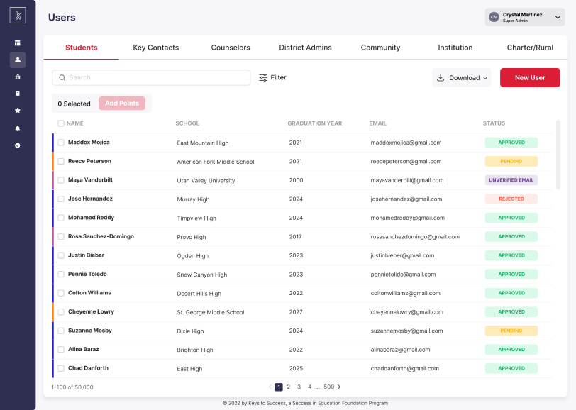
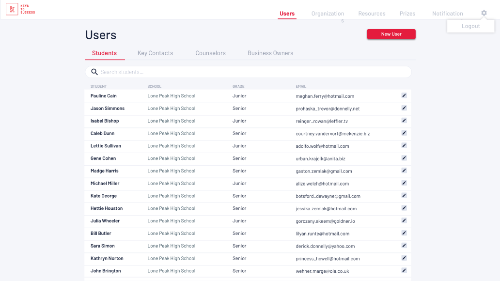
The Keys to Success admin users of the application had an admin login/tool that was operating like a website instead of a control panel. When a user logged into the application, the first screen they would see is the Users screen. While this is a screen that is used often, there were better uses for such key real estate of the first screen a user sees. The admin users realized there were some features that users chose most often, but some of those features were buried within the application.
SOLUTION
Turn the first screen seen on application into a control center with a dashboard. Include a quick access version of the requested and most-used features on the dashboard. Move the navigation from the top to a sidebar on the left that expanded and collapsed. Create a design system and updated the overall UI of the application while using the new navigation and dashboard as a starting point.
PROCESS
PHASE 1
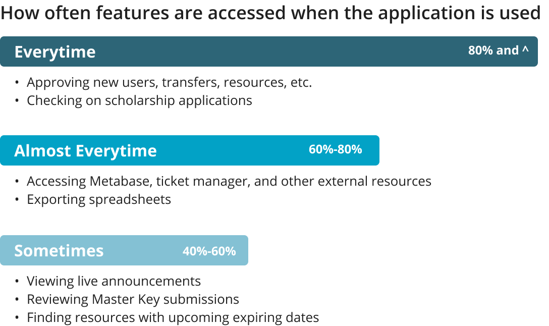
When I started on the project, the application had outdated UI and was functioning like a typical website instead of a place where adminstrative tasks are handeled. While talk of updating the UI was in the works, it wasn’t in the budget for the year. Because of this, I created a homepage on their current app that included widgets for their most-used features at the time. I worked with the program manager and other employees on the KTS team to figure out what features on the app were used the most and could have a “snapshot” version displayed on this new screen. The page continued the style that the application currently had. These widgets gave an overview of the feature and would take them to the original page with the full details when clicked on. The homepage was adjusted for users with less access than the main super admin users by removing the features they didn’t have access to.
PHASE 2
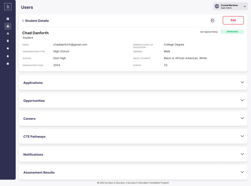
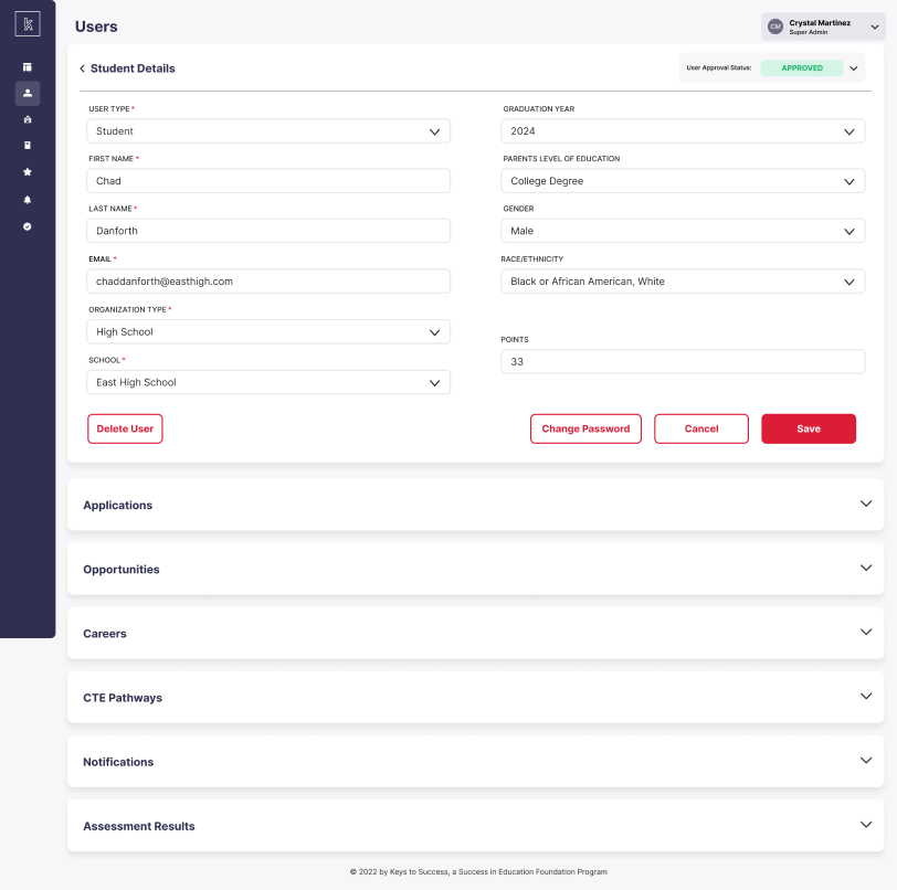
The next year, the client was convinced that a UI refresh was desparately needed. I was able to take what I had made on the dashboard I had created previously and use it as a starting point for what was now going to be their dashboard screen. This would be the first screen they saw when they logged in. I also switched the navigation from the top to a panel on the left that expanded and collapsed to have more screen space available. Along with these changes came the overall UI update for the entire application. To start this I created a simple design system including font styles, buttons styles, form styles and other componenets based on their current brand guidelines. This design system was implemented to the new naviIgation and dashboard first, then the rest of the application after that.
PERSONAS

PERSONA 1
Keys to Success Super Admin User
A type of admin for the Keys to Success student mobile app. User has access to ALL admin features. They approve actions taken by users of the student app and actions of other admin users with limited access. There are <10 users with this type of access.
PERSONA 2
District Admins
A type of admin for the Keys to Success student mobile app. They have access to limited features that are chosen by the super admin based on what they know these users use the app for. They need to get certain actions approved by a super admin user. User mostly uses the app for gathering data about their school district and adding scholarships, internships and other opportunities to the student app.
PERSONA 3
School Admins
A type of admin for the Keys to Success student mobile app. Users have access to limited features that are chosen by the super admin based on what they know these users use the app for. They need to get certain actions approved by a super admin user. User mostly uses the app for gathering data about their specific school.
ROUND 1 MOCKUPS
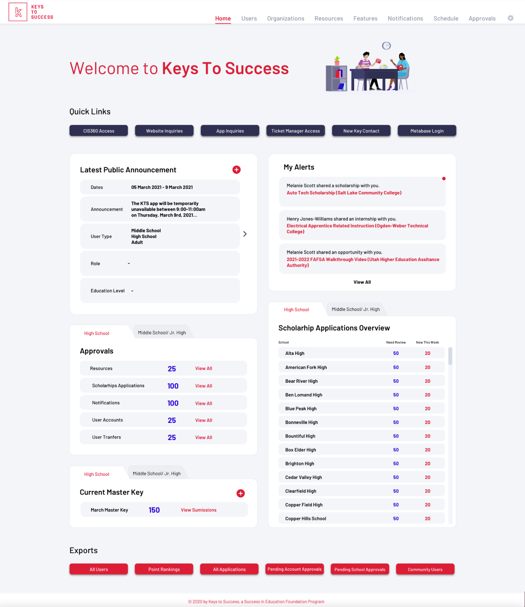
The first version of this dashboard was the homepage using the old design of the app. While desigining this, I knew there was so much potential to make this dashboard feature incredibly useful while also looking current. I kept ideas I had for this screen for a potential UI make-over that I hoped was in the near future. I even built a version that had a slightly updated design to encourage them to do the UI updates. While the client loved what could be done in the future with the updated version, they were still very excited for this “homepage” feature to be implemented on the current app because it was going to be a huge time saver for them.
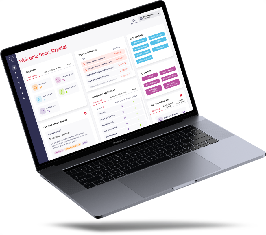
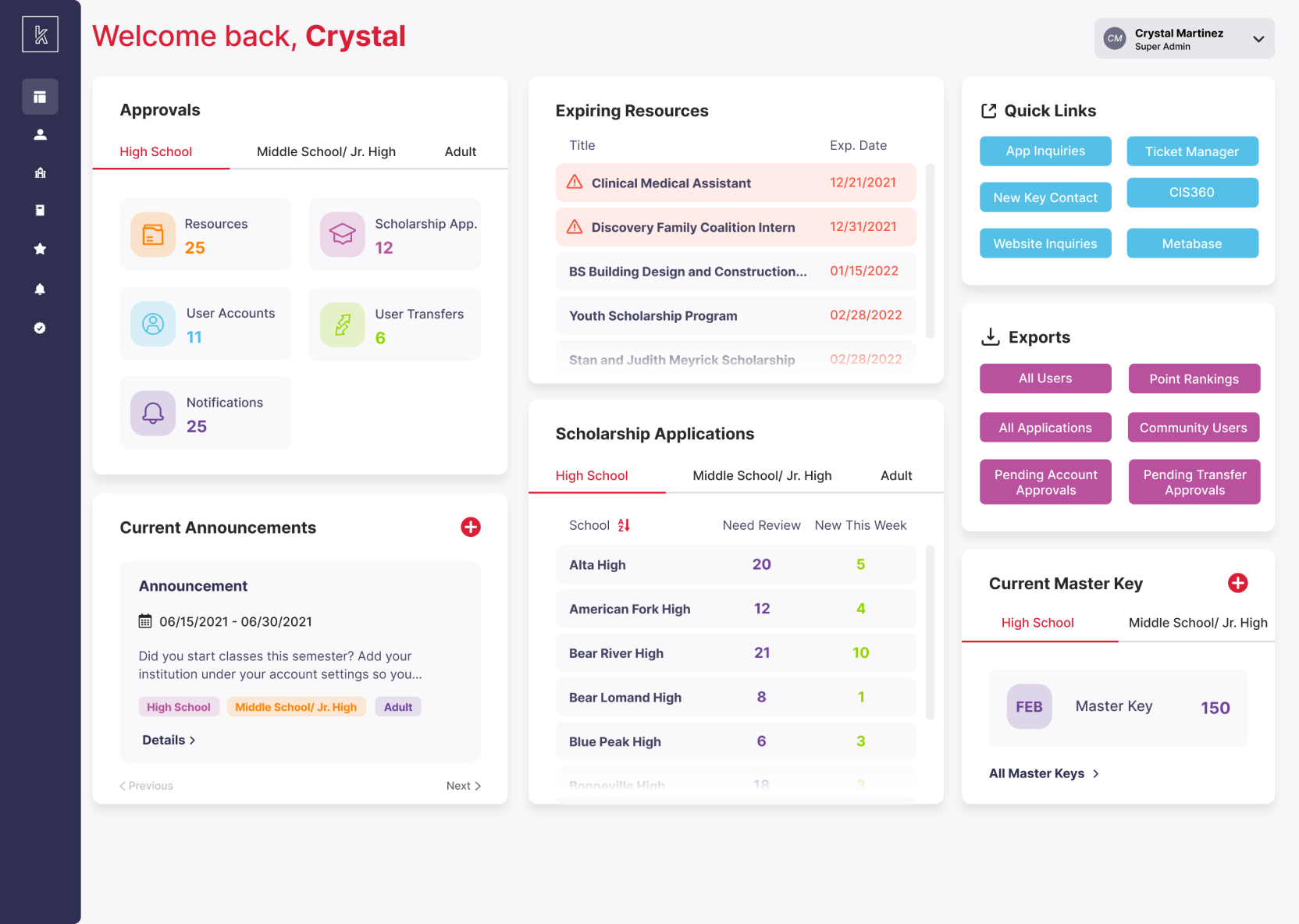
This dashboard includes a way to see if any announcements are currently live on the admin app (and quick access to add one), stastics on how many approvals are needed, information about the current Master Key feature, alerts, numbers for scholarship applications, quick links, and quick exports.
DESIGN CHANGES
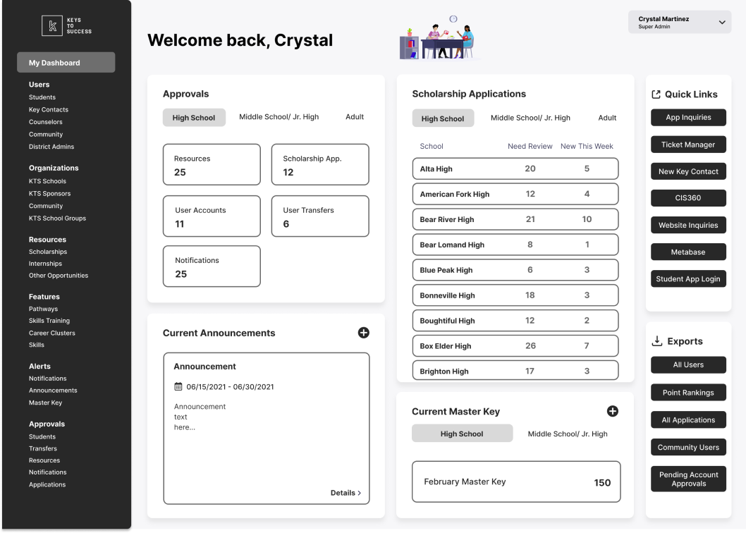
When the budget for the app UI refresh was approved, I had a great starting point with my original design. Some time passed since I made that version, so I started doing research on the most current dashboard experiences and styles. While a lot of the UX was remaining the same, I had the chance to start totally from scratch (while still keeping branding colors and fonts) with the UI. Along with the overall UI update, I moved the navigation from lining the top to a sidebar menu on the left that identifies sections by icons and has subsections shown in a popout when clicked on. This allowed more screen space to be used throughout all of the app.
DESIGN SYSTEM
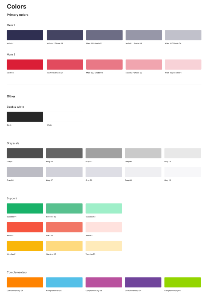
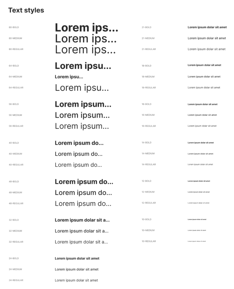
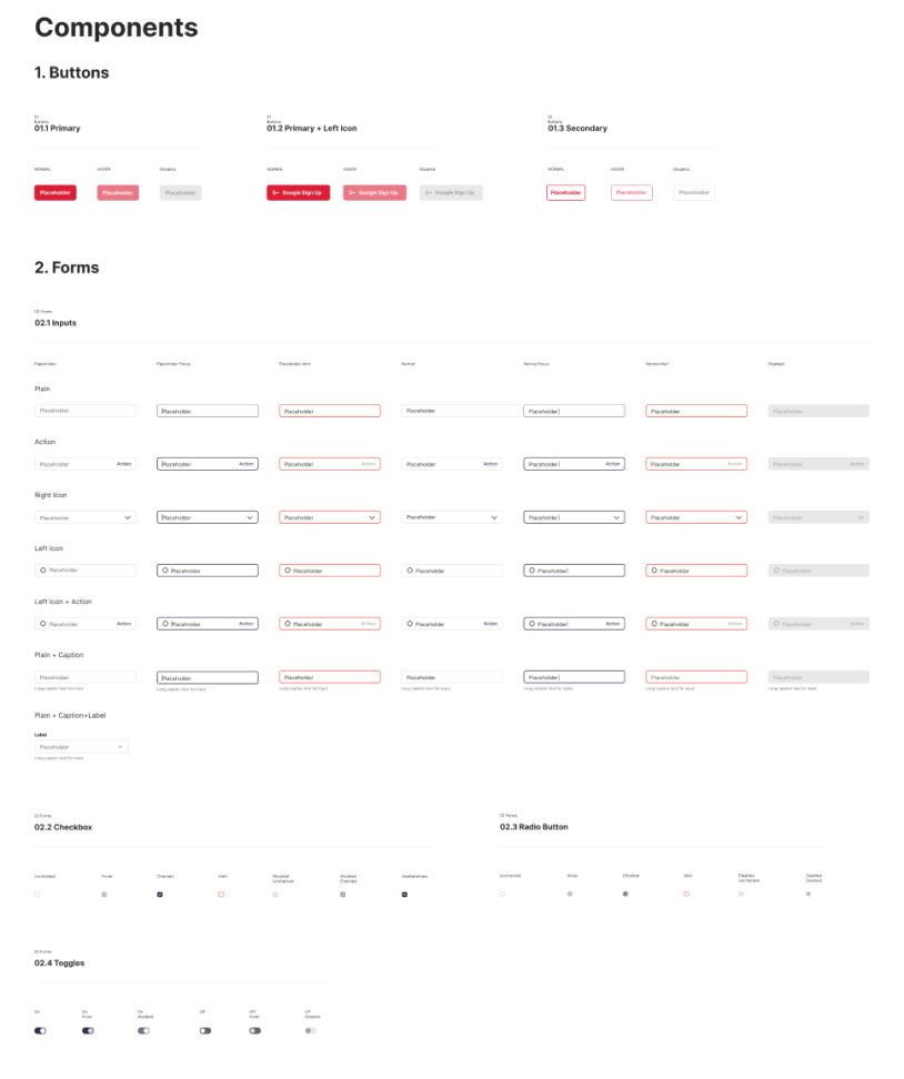
I created a simple design system that included colors, typography, button styles, form fields, checkboxes, radio buttons, toggles, and some icons. The brand already had a color palete and font selected, so I applied those into the system. I was first focused on the homepage-turned-dashboard first, but I kept in mind the rest of the app as I created the system. I had worked on the app for a long enough time that I knew what would and wouldn’t work within a system. And the rest of the app was also getting the facelift, but none of the UX would be changing at this time.
FINAL DESIGN
The final design enhanced the experience of what had already been created and had a very impactful update to the UI. The new look and feel has a much brighter presence which encourages a more positive attitude when users log into the app. I was able to correct some flaws I found in my original design, mainly condensing sections by adding a scroll and using the brand colors to give each feature on the screen their individual identifiers. One of my favorite updates was changing the tab design that was present in mutliple feature sections on the dashboard. I placed them all on one line with a highlight bar below the selected item. This not only saved space, but was also used throughout the rest of the app on internal pages.
PRODUCT SUCCESSES
The client was so excited for the dashboard feature to exist on the old version of the app. It achieved their goal of having a one-stop place where they could get a quick overview of some of their most-used features. The final version with the new UI blew them away. The dashboard that showcased the new design system got them excited for the rest of the application to get the UI makeover and solidified their decision that they made the right choice to move forward with this project. As the new internal screens were presented to the client, they were inspired to add even more features to the app to make the experience better for them as the “super admins” and the other users of the application.
WHAT I LEARNED
Having the opportunity to create a solution to the problem and then, later, make it EVER BETTER was a great learning opportunity. The two designs showcase how much I improved as a designer in the eight months between both of these projects. Getting the chance to take a long step back and then re-address the problems gave me even more insight than I would have gotten on another type of project. Looking back, I think that I could have made the original version of the dashboard have more specific and interesting UI, but part of my tactic was to show how it could be so much better if they went through with the UI redo, so it worked out in the end. I also learned how much branding affects how I design. It was less challengeing the second time around when the overall look and feel of the site was more modern and less restrictive.