

COLLEGE APPLICATION CHECKLIST
Keys to Success, Success in Education
PROJECT OVERVIEW
CLIENT
Success in Education, Keys to Success Team
PROJECT
College Application Checklist Feature
SCOPE
Create a checklist tool for high school users to guide them through the college application process. Checklist to include steps to learn about colleges/universtities in their state (Utah), apply to college, learn about financial aid options, and apply for scholarships and more. The release date of this tool was aligned with a statewide initiative that all high schools participated in called “Utah College Application Week” so that students would have a guide they can use on their own in addition to their college counselors at school.
ROLE
Lead Experience Designer
COLLABORATIONS
Development Team, Project Manager, Account Director from Hoverstate, Program Manager from Keys to Success team, Utah System of Higher Education Team

PROBLEM
Keys to Success is an education-based app that helps high school students and adults navigate their way towards higher education. On the app users can discover career options, track progress in classes they are currently enrolled in, learn new skills and even apply for scholarships, all while earning points to spend on giftcards to local restaurants.
The Utah System of Higher Education (USHE) has an annual College Application Week every October that is used as a time for schools to encourage 12th graders to prep and submit their applications to in-state colleges. The Keys to Success team wanted a redesign of a feature that had been created the year before as a way to help guide students along the college application process. The goal was that this feature would be especially helpful during the already existing College Application Week. The client and the USHE team needed several additions to the current feature to be a highly used feature on the application and to get extra emphasis during the actual college application week.
SOLUTION
Create a checklist of steps that are needed to learn about in-state universities, complete an application, apply for financial aid, and find scholarships. Include resources from other organizations that help with similar efforts in the checklsit. Re-use screens/sections from current feature within the checklist wherever possible. Give access to this checklist on the homepage of the app and promote it during specified dates surrounding the state’s college application week.
PROCESS
PHASE 1: RESEARCH
I started the research phase of this project with in-depth research on user experience and user interface on lists, tasks, and progress indicators. After gaining knowlege in those areas I had interview style meetings with the key stakeholders including members of the Utah System of Higher Education organiIzation, the client, and my internal team. We were able to get some great insight from others at my company who had gone through the college application process in recent years. These conversations lead us to come up with the firts draft of the checklist items we would need to include.
PHASE 2: RECYCLING THE CURRENT FEATURE
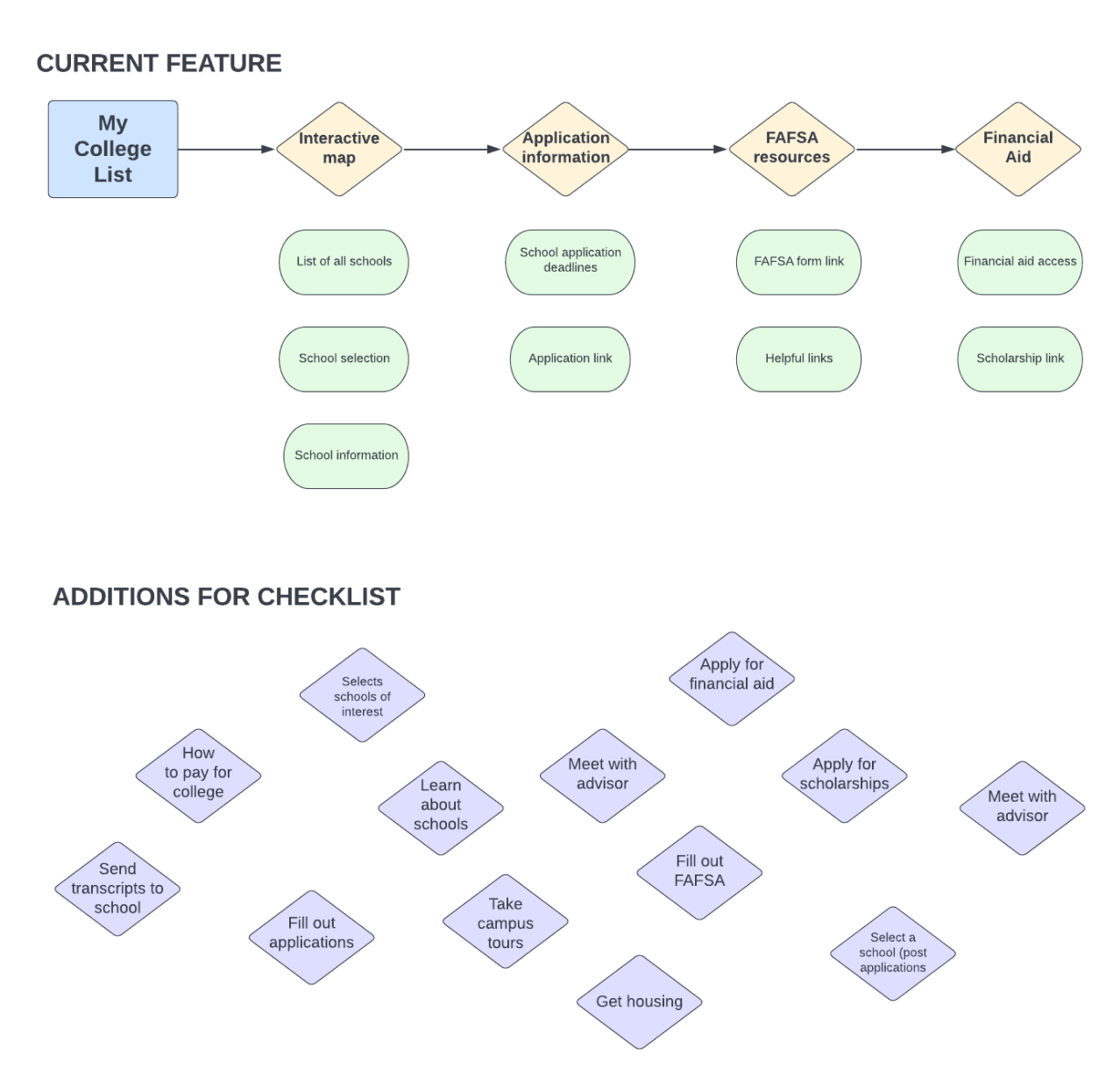
Before diving into the wireframes and high fidelity designs I did an in-depth inventory on what the feature currently provided. The client wanted to use as much as we could from what was already existing, and luckily I found a way to incorporate most of them into the new flow with a few tweaks. (Ex. A list of all in-state schools already existed so I was able to reuse that screen, but how to select a school was altered to fit the new experience.)
PERSONAS

PERSONA 1
The Power User
A 12th grade student (in their last year of high school) who is a new or current user of the application. User is interested in trade schools and/or universities in their home state of Utah. This user has the intent to complete part of or the entire checklist as they are applying to schools. They most likely have spoken with their school counselor about their college options. User will come back to refer to this checklist and the resources it provides throughout their time applying for colleges.
PERSONA 2
The Browser
A 12th grade student (in their last year of high school) who is a new or current user of the application. This user learns about the feature through school, word of mouth, or on the app itself. User is interested in at least one trade school and/or university in their home state of Utah. They will browse the feature to access other resources that are provided (both in and off the app). This user does not have the intent of actually using the checklist as a guide, but rather, taking bits and pieces they need from what is provided on the list.
WIREFRAMES
I started with what was already on the application, which was a flow that allowed students to select schools they were interested in and gave access to resources/applications outside of the Keys To Success app. Some of the already existing screens worked as indivudal checklist items based on the new requirements.
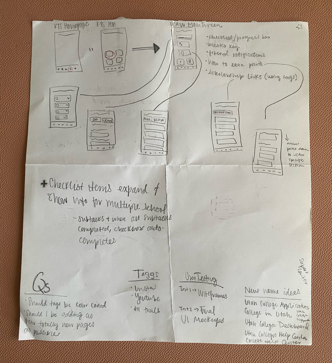
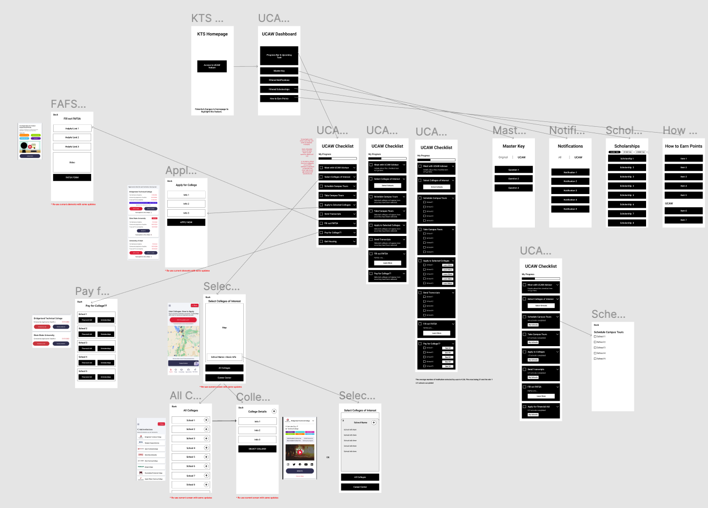
Next, I prioritzed what actually needed to be on the checklist and compiled my draft of the checklist items. After that I had to decide the best approach for handling use cases where a user would be interesting in applying to more than one school (which would be most users). I decided to use a subtask checklist system on items where school selection was applicable.
DESIGN CHANGES
As I started working on more in-depth wireframes, I realized the subtask format I had was going to take up too much screen space and got very repetitive because the same school names were listed as subtasks multiple times. I explored the idea of having one checklist per school, but based on the research I had done on lists this wasn’t as intuitive for the user. I ended up going with a flow that allowed the user to tap on the checklist item and go into a details screen for lists items that involved more than one task (because of multiple school selection).
I originally had the various resources/links that needed to be included on the feature spread throughout the list items. But I ended up grouping the checklist into sections. I made the in-app resources to one location below the checklist which created more a space for users to know what they could do within in the app that related to the College Application Checklist.
DESIGN SYSTEM
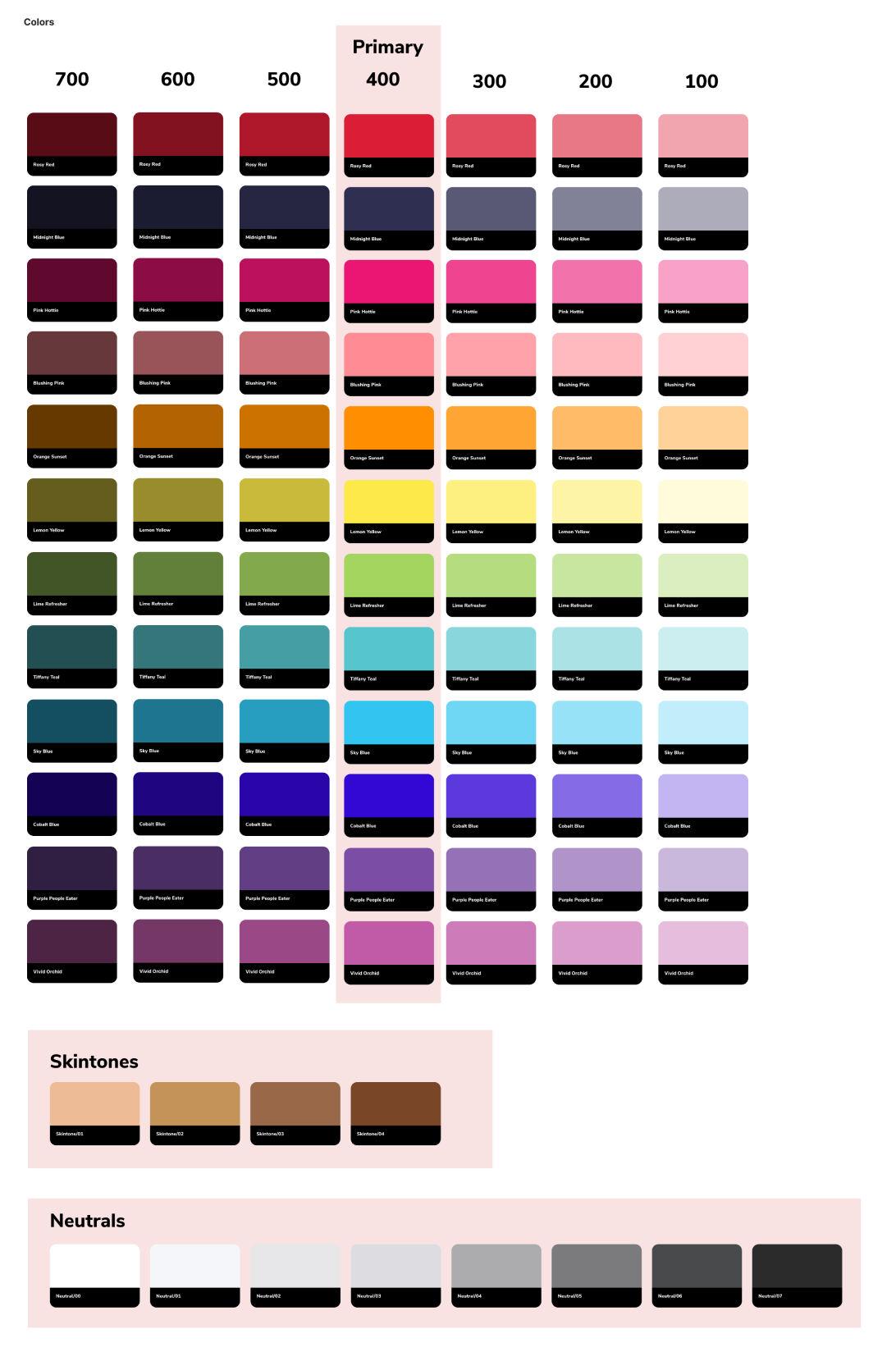
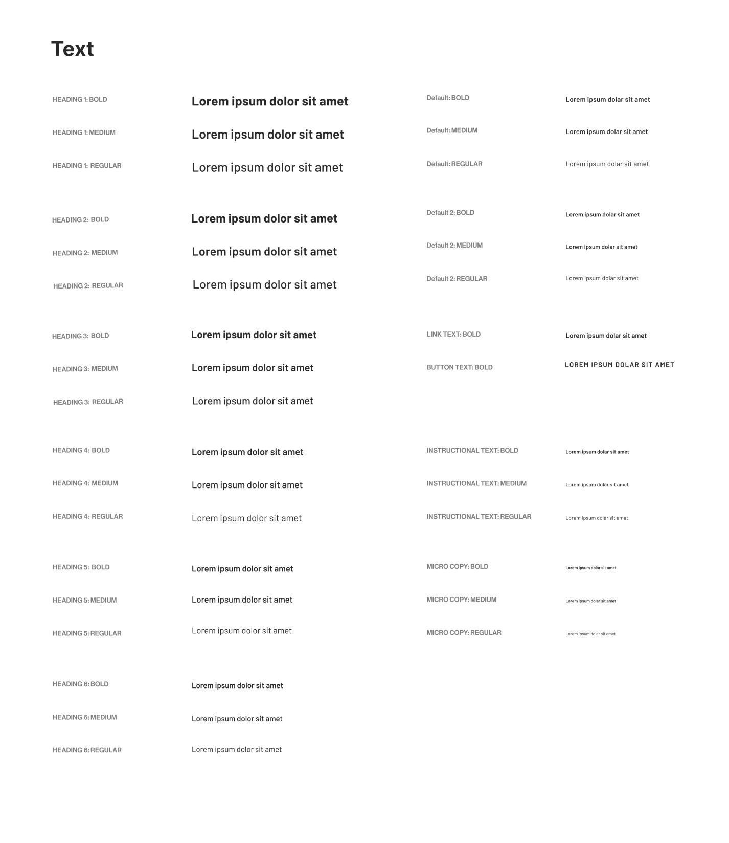
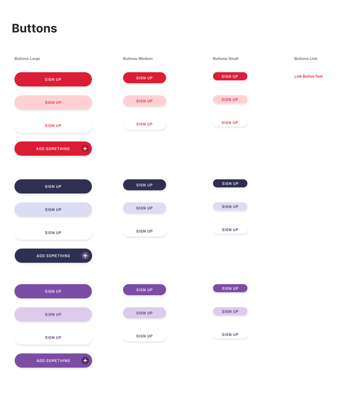
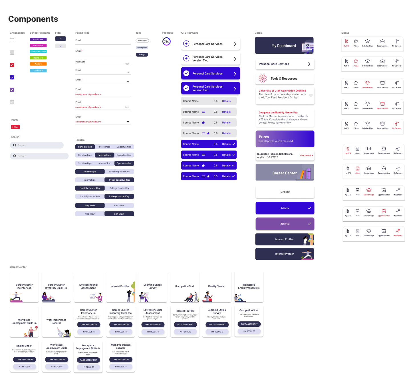
A Keys to Success design system that included colors, fonts, buttons, components and icons was already in place for this application so, I was able to follow it for this new feature. I added elements to the system as designing where necessary.
FINAL DESIGN
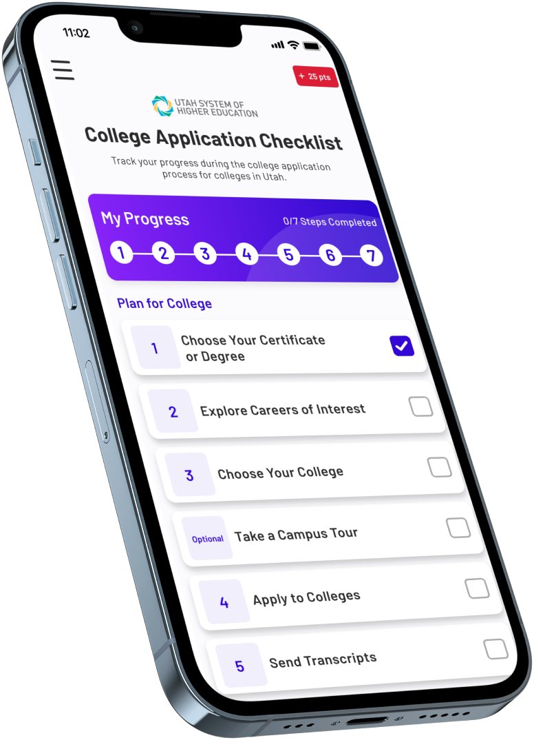
The final design was an in-depth feature that helped connect the app’s different parts. The feature included and itemized list of the steps necessary to prepare for college, an interactive map to locate institutions in the state, links to federal and state resources all while allowing students to earn points while completing specific tasks (a motivating aspect for users that is used throughout the whole app. Originally, the checkmarks did not all get checked off in the same way (some were automatic based on the user’s actions), but in the end I gave all of them the same experiIence, which is that they mark the task done themselves. If there is more than one item/school listed for the task, the main checklist item only checks off all after all checkboxes on the details screen have been marked as completed by the user. This was decided because while some items had the capabiliIty to automatically be checked off based on taps from the user, some needed to be self marked.
The already existing screens were enhanced to create a more seemless and connected experience. Most notable is the interactive map screen that is powered by Google Maps. Users are now able to “select a school” when they tap on the location icon for the school, whereas before, they had to click on the details to add the school or add directly from the list view. The map screen also got a toggle at the top to go back and forth between the map view and list view. Users are also able to see the distance to a school based on their zip code.
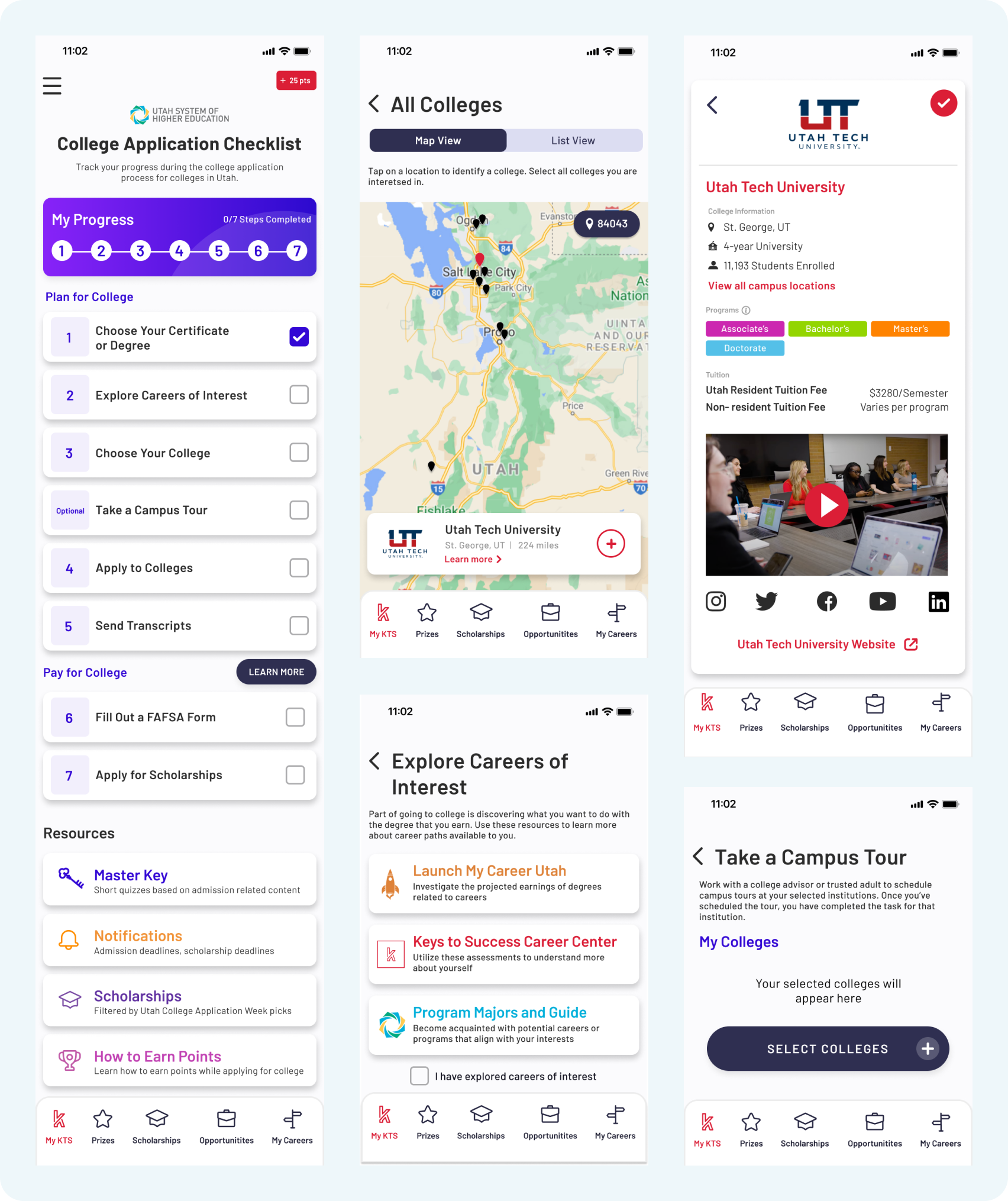
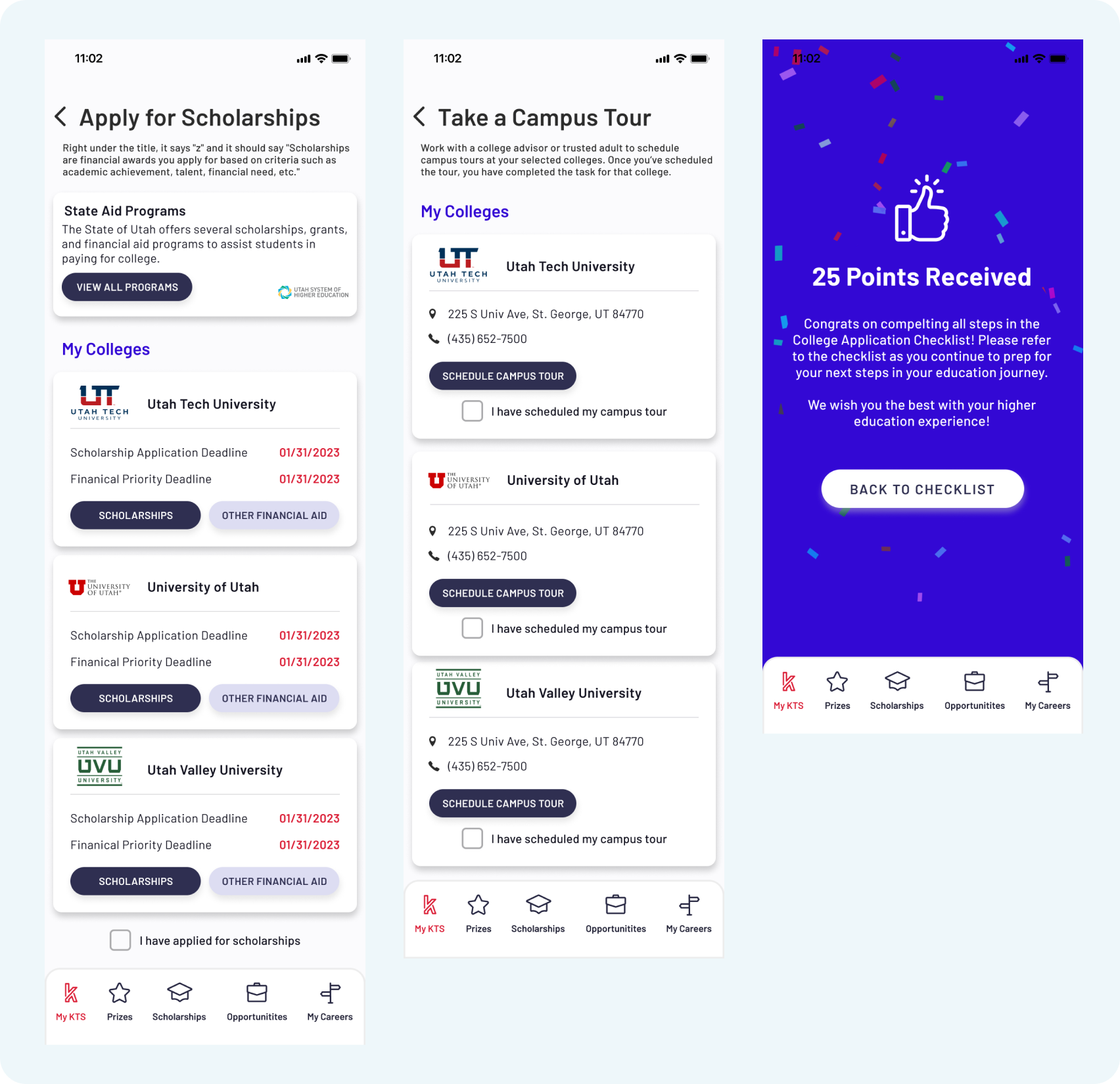
The feature got a well earned access point on the home screen of the app and at the time it was finished, the goal was that it will eventually become one of the most used features on the application itself.
If users completed the entire checklist, they are rewarded 25 points. This corresponds with the point system that already existed on the app. Users earn points all throughout the app for completing tasks like applying for a scholarship, taking a career apptitude test, etc. These points can then be redeemed for prizes (Ex. fast food giftcards, free items as local businesses). Users are notified that this feature earns them points through the announcement modal that is sent during Utah College Application Week to teach them about the feature itself.
PAIN POINTS
Unfortunately, time was not included for usability testing on this project. I worked with the internal data science team on where to track user behavior so that the feature can be enhanced by the next “Utah College Application” week which would be the following year. The statstics of the users actions are shown below.
PRODUCT SUCCESSES
The team was able to get this feature out in a very short time. The designs went through many iterations in the wireframe/low fidelity phase because of the multitude of routes to take with the list itself. The feature is an excellent resource for students who want to learn more about colleges within their state. It can be a place to track progress if they chose to start the application with any schools they are interested in. School counselors are able to utltlize this feature when working with students who are wanting to apply to college. Users are able to do things at their own pace and be rewarded for their hard work as they go, while always having a reference point when talking to school counselors, teachers, and parents.
The feature also includes multiple outside resources that students may not have learned about otherwise. Many of these resources fulfill the goals of the Utah Systems of Higher Education, who were involved with this effort.
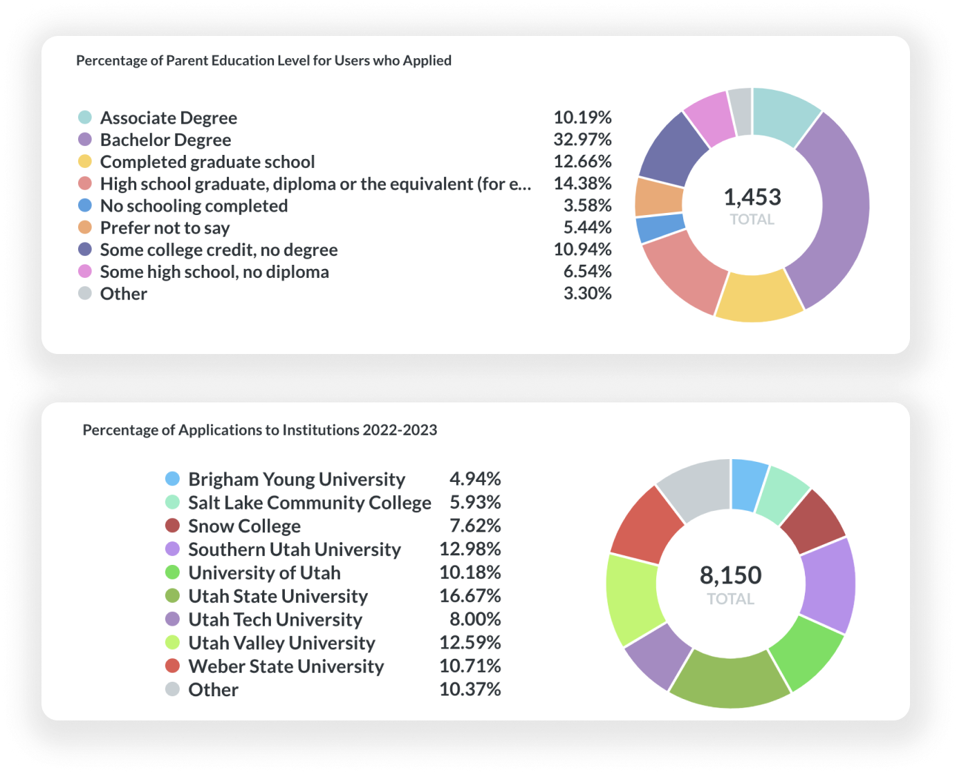
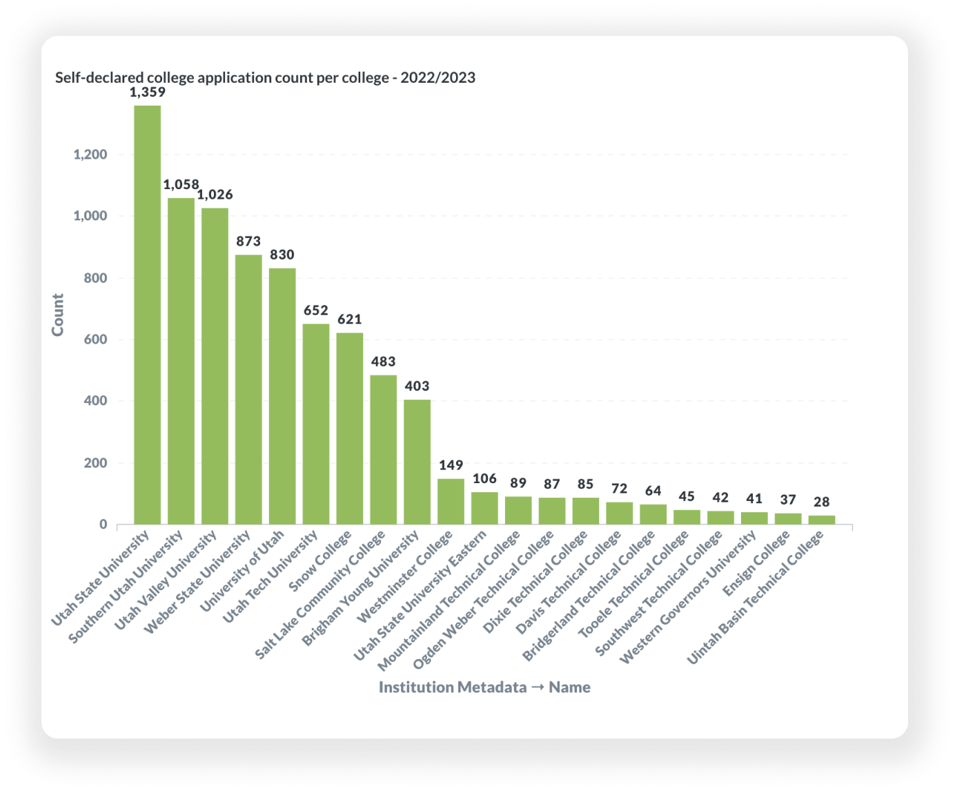
Other things to take into consideration when analyzing the data are:
- Did schools/districts tell students to use the app during College Application Week
- How many users applied for schools via the information from the app, but did not “self-declare” that they applied
- Did users who used the College Application Week feature already have an active account/familiarity with the app or were they new users
This data along with information from the Keys to Success and Utah System of Higher Education teams helped us decide on a plan to improve the feature before the 2023 College Application Week.
WHAT I LEARNED
During this project I learned how to take a stressful and very large task many people have to deal with at some point in their life and narrow it down into reasonable pieces. I liked that this feature was geared to be a one-stop shop for students living in Utah who may not have parents or family members who have gone through the application process before. I was able to balance creating instructions within the feature, with pulling outside resources that already existed.
Because there were many stakeholders from various organizations in this project, I learned how to strategize my designs based on many opinions (that didn’t always align). I was able to use my expertise in areas of design in a new way when presenting designs to large crowds with various goals associated within the groups. This project also helped me solidify my love for mobile design. Being constrained to a smaller rectangle of space is a challenge I am always eager to accept.
