

GLOBAL & DEALERSHIP PRODUCT CREATION
Kornerstone Administrative Services, Ken Garff Automotive Group
PROJECT OVERVIEW
CLIENT
Kornerstone Administrative Services, Ken Garff Automotive Group
PROJECT
Global and Dealership Product Creation
SCOPE
Kornerstone is a sector of the Ken Garff Group company. Ken Garff Group owns and manages car dealerships. Kornerstone provides an application for Ken Garff dealerships to sell car services to their customers (e.g., oil changes, tire rotations). These products can be sold/redeemed at the service lane by mechanics or by account admins. While in the process of building a brand new application, the flow for creating products to sell to customers needed to be revisited due to some issues with the current design (designed by a previous team). Products need to first be created at a global level with specific qualifications determined by admins. At a delearship level, users would need to select a product from the list of global products that had already been created, modify any necessary fields and then fill out more dealership specific information. This project was one part of a very large project to recreate an internal system the company already had on the Pega platform while also improving the experience of every section of the product.
ROLE
Lead Experience Designer
COLLABORATIONS
Pega Development Team, Product Manager, Project Manager, Account Director, Quality Assurance Engineer, Program/product managers of various levels on the Kornerstone team.
PROBLEM
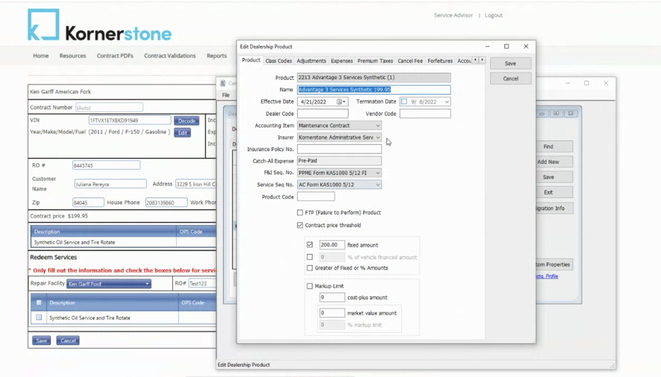
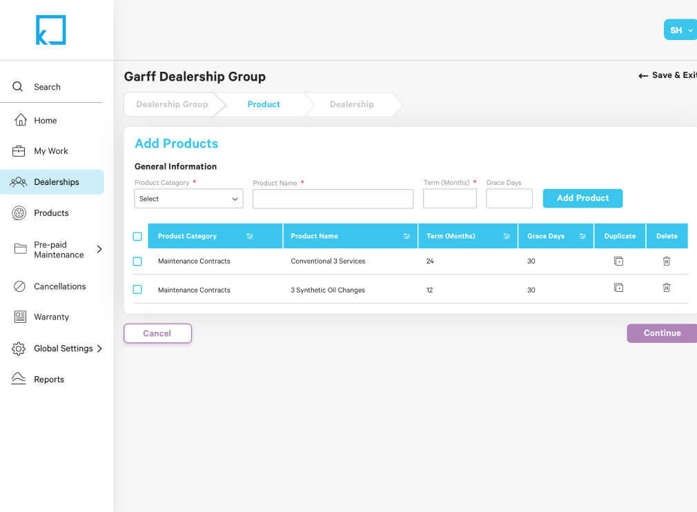
The current screen flow for this procedure was found to have some flaws as the product goals expanded over time. The client needed a way for users to create products at a global level that could then be selected by dealerships and edited to fit the needs of their specific dealership. The global products can be used as many times as needed by any dealership. This means the same global product can be used at a single dealership multiple times as long as the name and other necessary fields are given different names. These products affect many other areas of the application including accounting, sales and business growth development, so this needed to be taken into account while designing.
SOLUTION
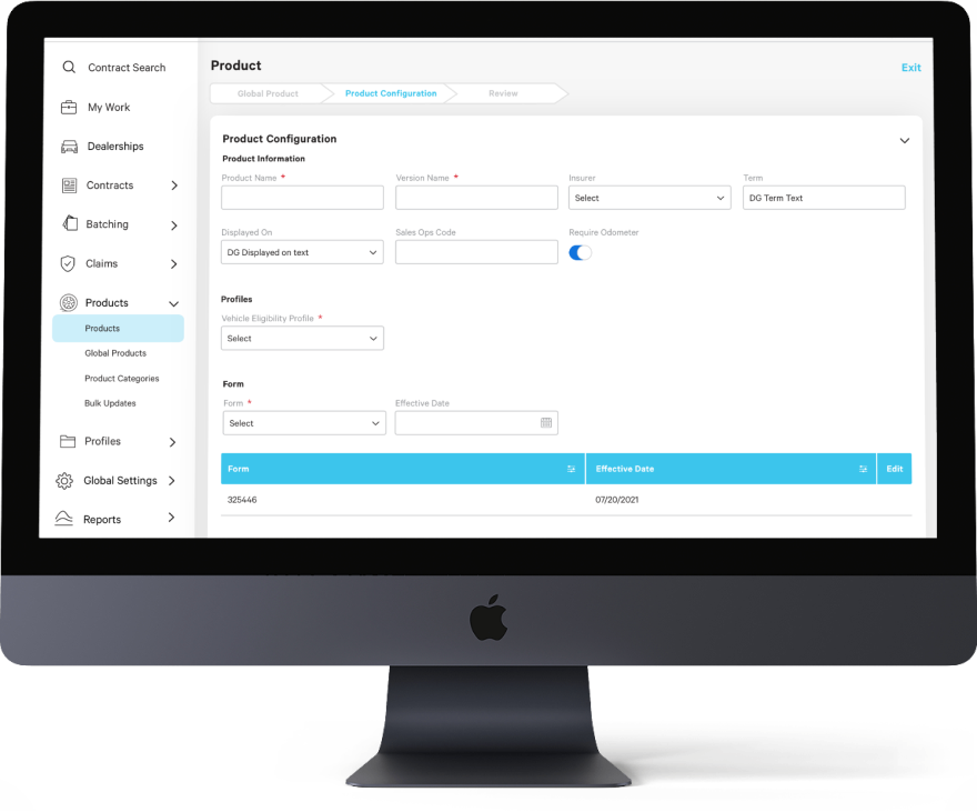
Move products from an experience in the dealership flow to its own navigation item. Include a drop down for quick access to the main categories within the product feature and include action items pertaining to these indiviudal items on the main screen shown when the subnav item is selected. Follow the current design system of the application.
WHAT IS PEGA?
PEGA is a low-code app development platform that offers existing structural solutions for complex, enterprise business needs. By building on an out-of-the-box foundation, the bulk of implementation can focus on building out custom features that deliver true utility to support unique business needs.
Pega is great for speeding up development time, but creates a lot of challenges in the area of design. Design is often sacrificed to keep elements as “out-of-the-box.” These limitations can create a negative experience for the users in some scenarios.
PROCESS
PHASE 1: Undertanding the old design
I was assigned to this project when my company decided to make a lot of changes to the team. I was put on as the only designer and was brought up to speed on the current design of the project. This “Creating Products” flow current had 3 parts (global products, dealership group products, and dealership products) that all admin users would create at a single time with the option to go back and edit later. With help from the project’s team, we were able to re-address all of the needs of this feature and then pick out what needed to stay and what could be removed. As a team, we decided to eliminate the second step of “dealership group products” as it was an extra step that could easily be managed at the dealership level. It took the client some convincing, but our reasoning provided enough evidence to persuade them.
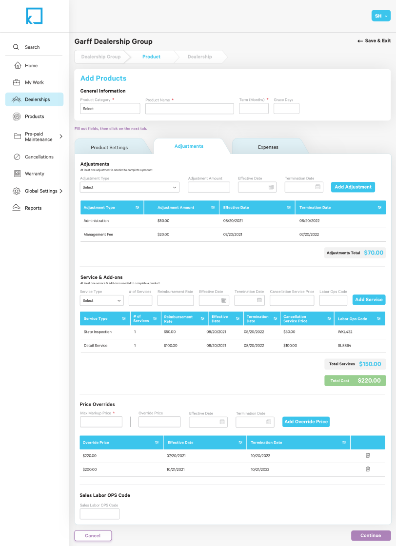
PHASE 2: Generate the new design
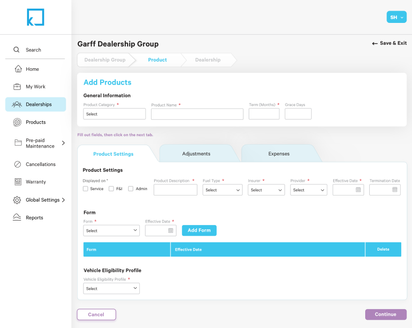
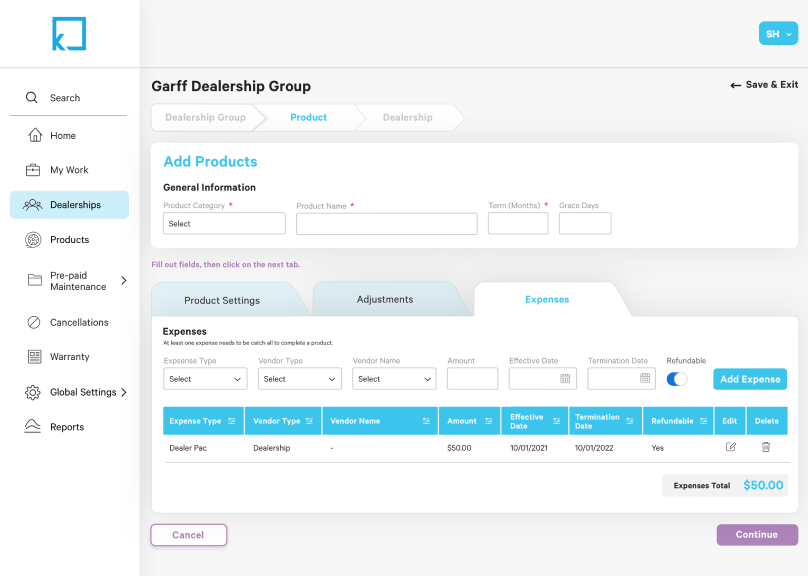
Working closely with the product manager and lead Pega developer, the wireframes were created for the global and dealership levels with an approach of simplicity. User cases for a Kornerstone Admin and a Dealership Owner Admin were used. After about three rounds of wireframes, the designs were approved by the client. I then made the high fidelity designs using the design system that was already in play for the entire product.
PERSONAS

PERSONA 1
Kornerstone Admin
An employee at the Kornerstone company who is a type of admin that has access to ALL features on the application. They have the power to create, edit, and remove products from the global level and the dealership level if necessary. As the only user type to have access to the global products, they are deciding what is included in the global products and what can be edited at the dealership level. There are >20 of these users.
PERSONA 2
Dealership Owner Admin
An employee at the Kornerstone company who is a type of admin at the dealership level who has the highest access for that specific dealership. They can create a product for their dealership by selecting a global product and the modifying it for the needs of their dealership. They can contact Kornerstone Admin users if needed. There are > 100 of these users.
WIREFRAMES
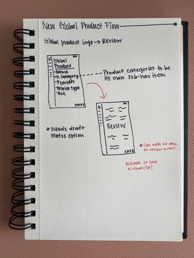
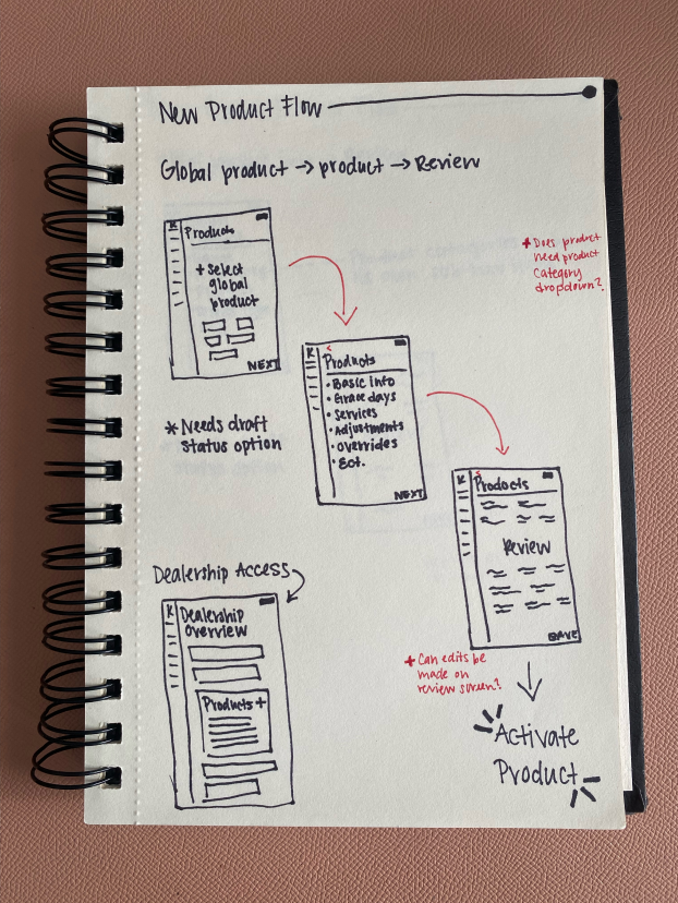
The first round of wireframes was similar to the original process that was already developed, but was displayed in a simpler way. As the team dove more into what we thought was going to be the new design we got a lot of clarification from the client that led to the design to remove the “dealership group product” step all together. Based on the new information we gathered, we decided that dealership admins would be able to manage their own products without being involved at the dealership group level. I was able to basically start from scratch in some ways, so I went back to square one and started on paper wireframes to get the new flow solidified.
As the updates were made to the wireframes it was made clear we needed information currently hard coded and needed to have the to ability to be changed by users. This became a mini-flow that applied to the main “Create a Product” flow. The user wouldn’t be making additions to product category very often, but it was now available for when needed.
USABILITY TESTING
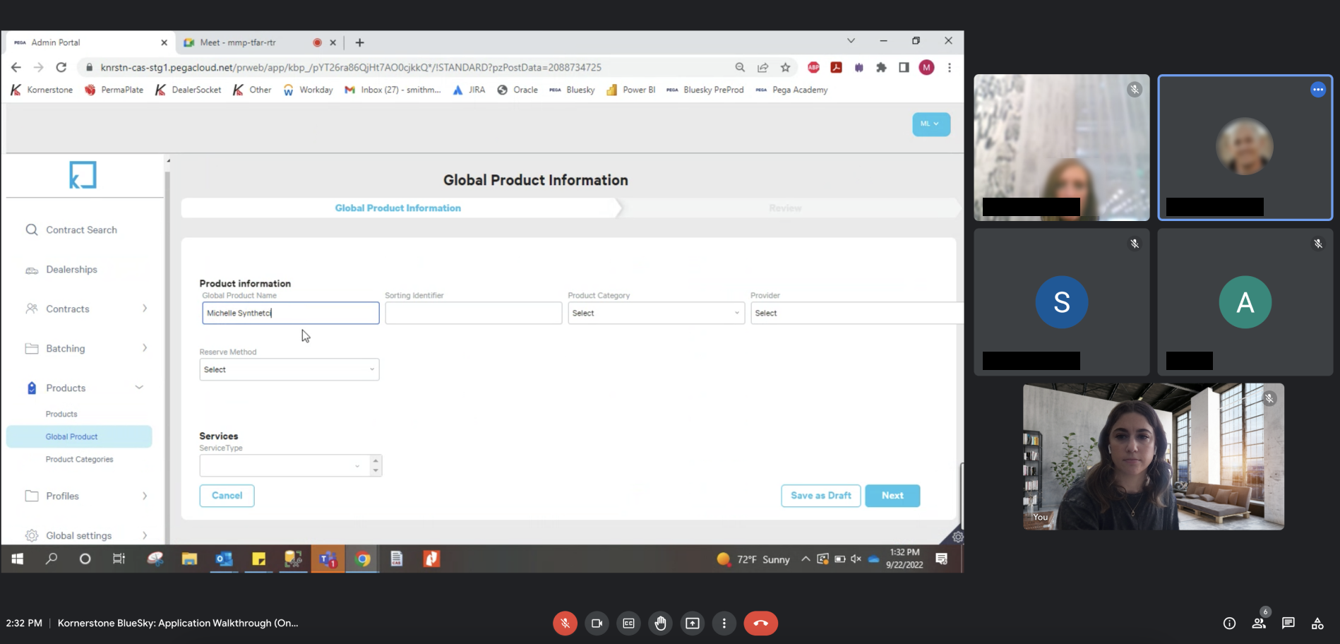
This specific feature of the product was built with the intention of less than 30 users. Because of this, we testing with the person who was going to be the biggiest power user on the admin side of the application. Working with the product manager, we had the user go through the full process of setting up dealership group and dealership products, without any guidence. There were two spots where the user was unable to move forward in the process because of confusion. Once the user made it through the entire flow we had discussions on where they got stuck and worked with them to decide if the experience needed to be changed or if more instuctional text was needed. We also learned that some of the grouping done on the pages with longer forms could be arranged in a different way to make more logical sense with how the business side of this process was done. The user on the client side also took her experience to a few others on their team for more input, and most of the feedback we got aligned with the user we had tested with.
PAIN POINTS
I had been working with the user we tested with for over a year and at this point had learned that their resistance to change was intense. They recognized the need for an upgrade in their system, but had been using their old system for a long time and was very comfortable on it. I took this into account while going through the test and pointed out areas where the experience was similar to the current system.
DESIGN CHANGES
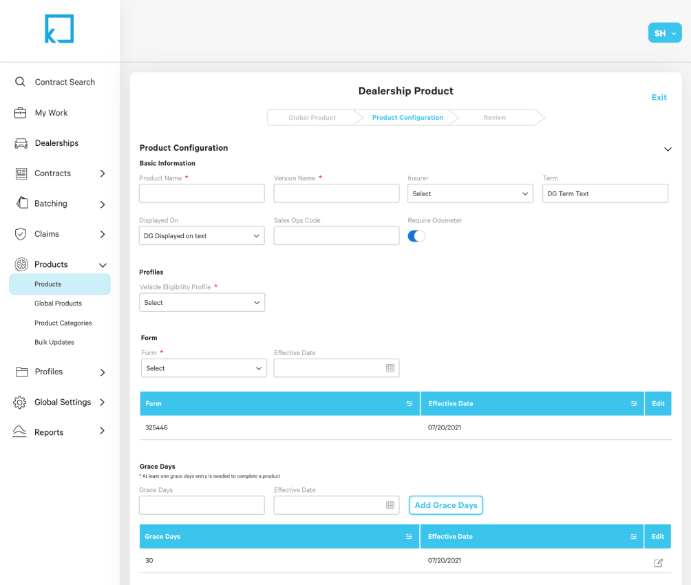
I moved the wireframes over to the digital side and was able to pull from the previous version of this feature plus our most current feeback from the client to get closer to the high-fidelity version of this flow. Minor changes like form field titles and order of the form fields were made to the wireframes and they were discussed more with the client. A new progress bar that includes: Global Product, Product Configuration, and Review was added to this flow for users to better understand where they were in the process and what was left. The final review screen is crucial because before there was no place for the users to do one last check before completing a product. he goal is that this progress bar will result in less user error before sumbitting a product.
FINAL DESIGN
The last round of the designs eventually turned into the final design and became the base for everything else that was later added to the new product section of the application. This helped in saving all usert types time, but especially the Kornerstone admin users because they oversee the actions of all other types of users. The final design followed the design system that was already in place in a better way than the original design, which helped with the overall consistency of the product. In this phase I was able to add iconography to the new products section in the menu that aligned with the iconography already selected. This new access point on the menu now acted as a one-stop shop for anything that had to do with products for Kornerstone, and it set up a place for features coming later on.
WHAT I LEARNED
Band-Aid fixes just don’t always cut it. I was involved in this project for a while before we were actually able to start from scratch on this flow. Both the client and my internal team were aware of the gaps and poor usability of the current flow, so until we got to start on this project, I had attempted multiple times to salvage what had already been created with new buttons, sections, and additions. While my team knew we could improve the process if we started over, it wasn’t until after we started on that we realized how much was missing from the flow and how incomplete the current really was. I’m glad I got to be a part of this re-do project and bring a new, fresh perspective onto the project. Not being involved in the intial discovery phase of the project intially made onboarding to the project a little difficult, but because we were able to re-address this flow again with the client, everyone on the client side and my internal team side were happy with the end result.
*This project already had some elements of a design system for me to follow as I worked on this feature (text styles, button styles, form field styles, table styles). Ideally, these styles could have been updated to create a more updated look and establish better best practices. Unfortunately, I wasn’t able to implement any of those updates during the time I worked on this feature.
