

HOME INSPECTION TOOL
Lessen, Turns & Renovations
PROJECT OVERVIEW
PROJECT
Property scope tool
SCOPE
Property scope tool that allows Field Project Managers to inspect an entire house room by room. The tool allows users to mark items within the property that need repair before the property is rented out. Once a scope is submitted, it is sent to a desktop internal portal where supervisors and client and review it.
ROLE
Lead Experience Designer
COLLABORATIONS
Project Manager, Product Owner, Off-shore development team, various stakeholders, actual users.
DATE
June 2023
PROBLEM
The company’s Field Project Managers (FPMs) are employees who do inspections on properties and track progress on a renovations. FPMs were using a third party app on their iPads to complete property inspections. The software was able to gather the information needed, but it was not connected to Lessen’s other software to use throughout a project’s life span because it was not an in-house product. For a property’s inspection (scope), users had to complete their tasks on the iPad and then go transfer the data onto software on their computers. This added a lot of time to their busy schedules. *The company had an in-house app that from an earlier time that was not being utilized and did not include the main tasks the users needed.
SOLUTION
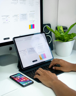
Create a scoping tool on the previously existing internal iPad app alongside updating the app to current design system/updated branding. Tool to cover scoping process from the start of the process (arriving at a new property) to the end (submitting the scope for client & project supervisor to review). Tool to coincide with the already existing desktop/web application that stores data on properties for FPMs and Project Supervisors to access information.
PROCESS
PHASE 1: RESEARCH
- Competitive analysis of current app being used and other similar apps
- Interviews with actual users to see what their current process is like and what they like/don’t like about the current app being used
- Understand old version of app find out if anything is able to be reused
- Work with stakeholders to understand upcoming scoping process updates so that app can encourage those behavioral changes in the users
PHASE 2: UX & UI
- Journey map entire user flow (including new steps in process from stakeholders)
- Wireframe user journey and TEST with real users
- Implement feedback from users and stakeholders
- Create high fidelity designs
- Apply new design system to tool and entire existing app
PHASE 3: FINAL USER TESTING
- Meet with users a second time (some the same as the first round, some different) to go through hi-fi designs
- Implement feedback from tests
- Iterate designs as needed until launch
JOURNEY MAP
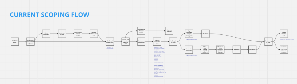
I started by mapping out the current journey an FPM takes to complete a scope (regardless of what digital tool they were using).
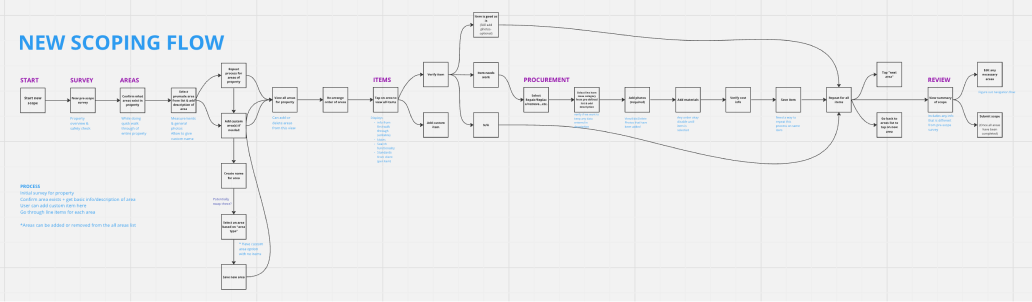
Then I created a more in depth flow of what the process the stakeholders wanted the FPMs to start following and added in my initial ideas of how to turnt those requirements into a digital process.
This new flow included an entire new section called “Procurement” that the FPMs would later be trained on as it was a new job responsibility for them.
WIREFRAMES
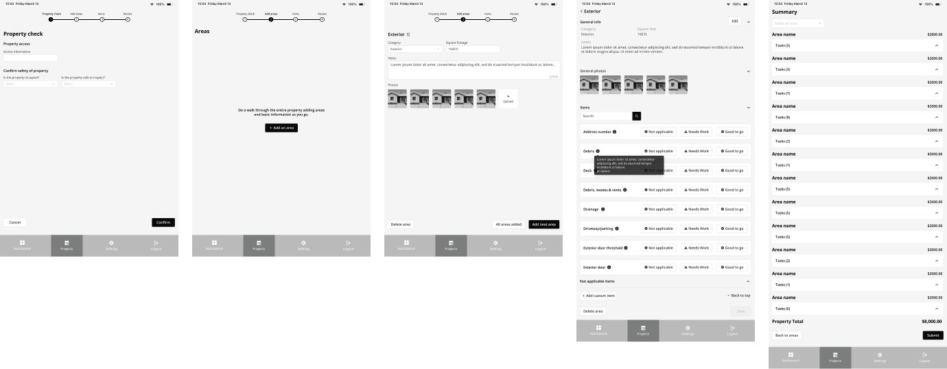
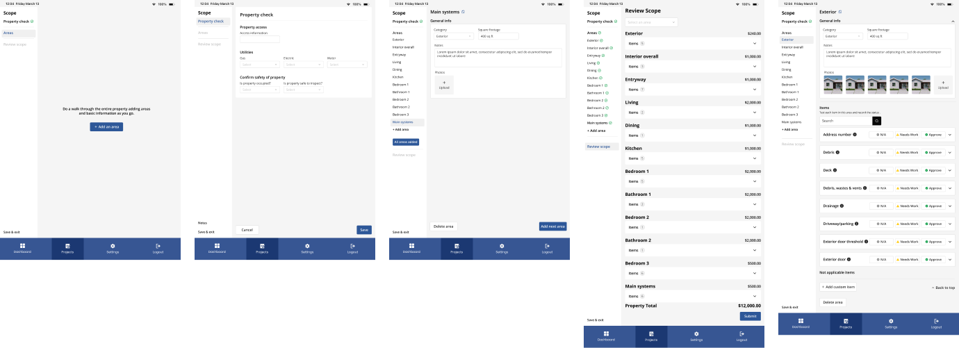
I started off with a progress bar to allow users to see where they are in the whole scoping process and broke everything into four sections
- Property check- A new section other competitors didn’t have with Lessen specific requirements
- Add areas - Where users will add all areas in the property (This is a slight change in the process FPMs currently had, in which they add and area and inspect items at the same time, then move onto the next area)
- Items - Where users will now inspect all items in one area
- Review - All expenses will be reviewed here before submitting the scope
DESIGN CHANGES
As the wireframes got built out on my end, I ran into issues with ability to quickly view all areas to access an area that was already created or to create a new area. I also started having problems with using buttons on the bottom right of the screen leading users through the entire process. Because of this, I changed the progress bar experience to now be a side navigation system. This would allow users to access all areas of the house in one glance, and because this is only used on iPad, we had the space for it to always be expanded.
USER TESTING
The feedback from the first round of user testing was very positive. Users really liked the side navigation as it was familiar to them from the current competitor app they were using. There was confusion about the new process of adding all areas and THEN inspecting all items, which was expected. We planned for this to be addressed by project supervisors and in training for the new tool. Overall, users were able to get through the wireframes easily and liked the direction the feature was taking.
DESIGN SYSTEM
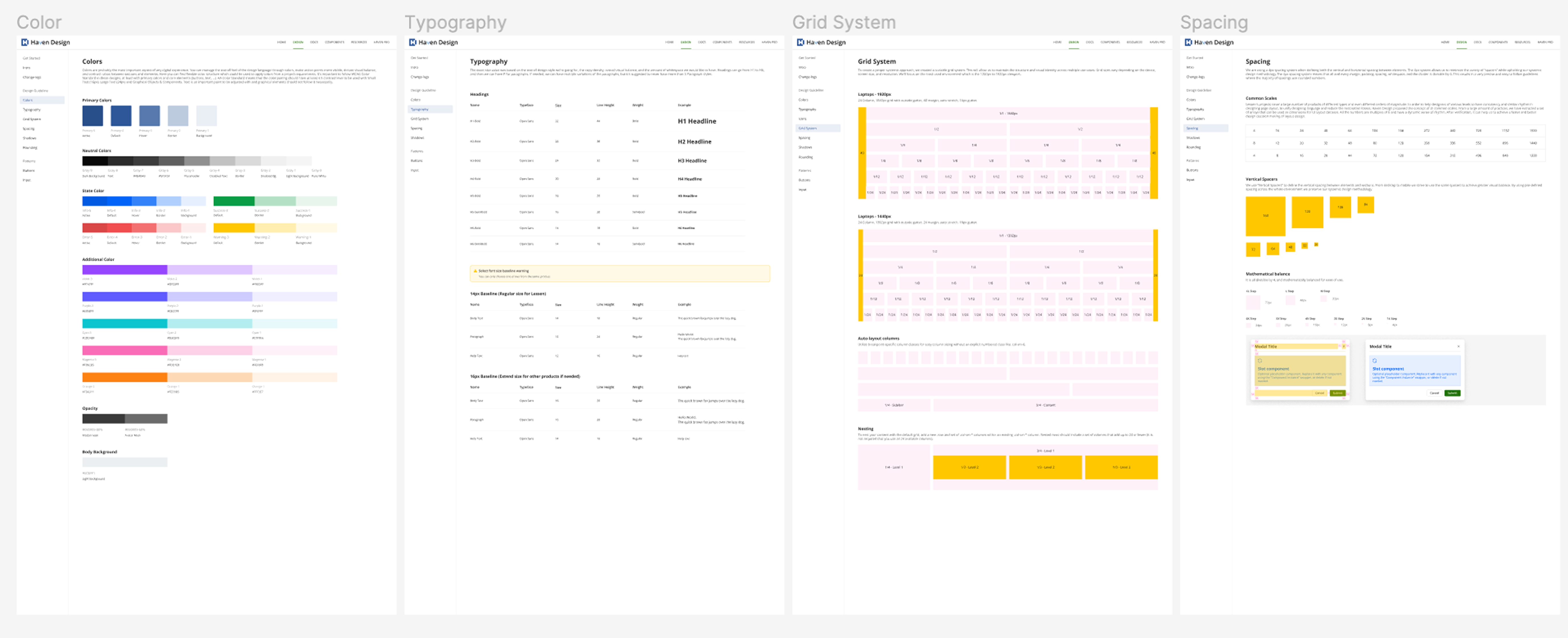
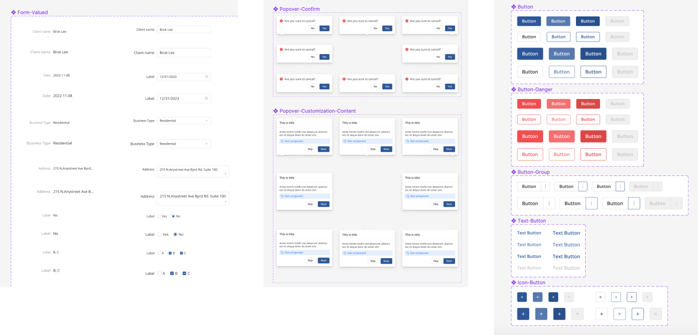
Phase 1 of a new companywide design system had just been launched as I was starting on this project. The mobile version of the design system has not yet been released, so I stuck to the desktop version everywhere I could and had permission to adjust things to mobile as needed. See some of what the in-depth design system included below.
FINAL DESIGN
Before my next round of testing I implemented updated stakeholder requirements and applied the design system to all of the designs. The stakeholders wanted an experience in which the most used areas on properties were pre-populated on the left navigation and users then had the ability to delete an area if the property they were scoping did not have that area. (There was still a way to add a new area and custom area if needed.) After many attempts of keeping the UI the same with these new requirements, I ended up adding an indicator under each area name that tells the user that there are required fields that are empty on this area. When all the required fields are filled out, the indicator is removed (or if the area is deleted).
There were also consistent changes to the requirements for when an inspected item was marked as “needs work,” so I kept iterating those screens due to changing opinions from different areas of the business.
USER TESTING
I tested with real users again (some the same as the first test; others were new). All of the users were really receptive to the side navigation as it was similar to what they currently use. There was some confusion on what certain fields were on the “need work” flow, but this was something being added to their workload, so again, it will be explained more in depth with the training that comes with the launch of this feature. I got feedback that users wanted more of an indicator to know when an area has all items inspected and required fields completed, so I updated the UI to make that more obvious. I also got feedback that users wanted to tap “save” on screens where they don’t actually need to save anything because the contents are auto-saving. For this I updated copy in the instruction text for adding areas and we have a plan to add some onboarding onto the tool for the first time they use it in the feature if we hear this as consistent feedback. Lastly, I learned that users wanted the ability to take more than one photo at a time in any photo scenario throughout the tool. I worked with the PM and the developers to resolve this.
After implementing feedback from the user test, I added the following features to finish off the high fidelity designs:
- A notes section that is accessible in the left navigation throughout the entire process where users can leave internal or client facing notes
- Full add photo from device flow
- Full take photo flow
- Photo markup capabilities
- A more robust “N/A” selection process for the item inspections
- A progress bar for the scope submission process (due to dev feedback)
- Error states
- All confirm cancellation or deletion modals
- Save & exit option
WHAT I LEARNED
Sometimes you don’t need to re-invent the wheel entirely. Going into this I really wanted to do something different with the UX/UI than what our main competitor was doing. Once I tested out the wireframes, I quickly learned that some of what the competitor had was well thought out and made sense in the specific scenario I was designing for. My user testing confirmed that keeping a similar design was what the right experience to include.
This project was also a great experience for me to embrace the process of iterating. The “Needs work” section saw a lot of iterations through the design process and post launch, and I learned to go along with all the changes while pushing back when necessary.
